
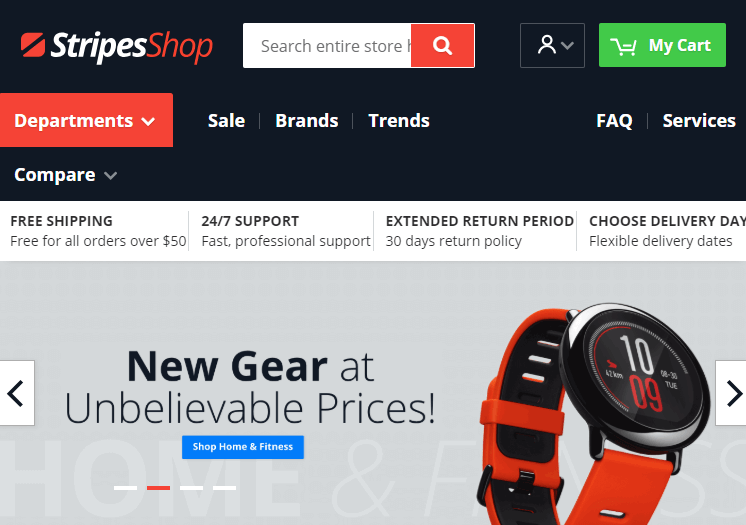
When talking about things customers want on an ecommerce website, the easy to use navigation is definitely item of interest the number one. The stats say the visitors spend an average of 6.44 seconds viewing the navigation menu. Thereby you have to make it as clean as possible, and attractive, too.
Let's open up more opportunities to make the navigation menu a bit more awesome. We are going to address the problems, occured when designing the menu in Magento 2 store. We bet you will enjoy the navigation menu tips and the ways to resolve the possible issues.
Everyone is talking about the ecommerce website navigation. Navigation trends 2018, navigation tips for website, navigation usability guidelines, it's all a part of it. Of course, we also write about the best website navigation, because we suppose it plays a key role in creating an amazing user experience.
- 9 tips to help customers navigate successfully
- Layered navigation tricks from famous companies
- Creating Amazon-like menu with ease
- 9 ecommerce navigation trends in 2018
And as any good store owner knows: “For any business, large or small, you have to provide the best possible user experience.” Today is also a good moment to reflect briefly upon the secrets to UX-friendly UI navigation. Keep reading.
Navigation UI/UX Design
Navigation design is a successful aspect of the user experience. The navigation menu and the usability of a website are closely linked. Let’s focus on some interesting tricks good for navigation menu design.
Sticky navigation menu
The sticky menu never goes out of style. Evidently, it is quicker to navigate, always at hand for your customers, and easier for visitors to navigate through a site. It always remains visible when customers scroll down. In fact, the fixed position menus have become a web UI pattern standard.

Drop down width mode
When it comes to appealing nav menu, the dropdownlist constant width doesn't always look nice. Thus there are different modes like boxed, full width or full screen, which allow you to change the dropdown box size on your main navigation bar according to the content length on dropdown.
Overlay feature
Looking at a trend, the overlay feature is one of the best web trends. This simple technique will overlay the menu across the entire screen except the active drop downs. You can set overlay for all dropdowns, or for the specific only. It enables the highlighting of the main navigation links shown in drop-down. That way you pay user attention on the main navigation links at your site. The feature looks great both on desktop and on mobile devices.
Responsive navigation menu
You know a good old responsive design aims to help your visitors have access to browse the entire website regardless of what device they’re using. You can keep all navigation items by using accordions, lists and other creative elements to hide or show content; highlight the sub-menus with an icon or color change. Welcome to read 30+ mobile site tips, easy to implement in 2018 that can be used as a basis for your own ecommerce business.
Fortunately there are lot of tools which help you create the responsive navigation menus. Just a little bit, and we consider the best of them.
Now please allow us say what we came to say. We will address the issues which can trouble both you and your customers within doing navigational tasks.
Navigation menu UX problems and how to fix them
Icons that is misunderstood
As you know the navigation menus can use the icons to help visitors navigate to the category they are interested in. But sometimes it is hard to guess what icon mean. Let's see.
A solution to the problem is adding labels alongside the icons. Text labels will help to clarify the icon's meaning. You used to know what to expect when you click on an icon. So your customers do. Thus you have to show absolutely clear navigation menu items just to avoid misunderstandings.
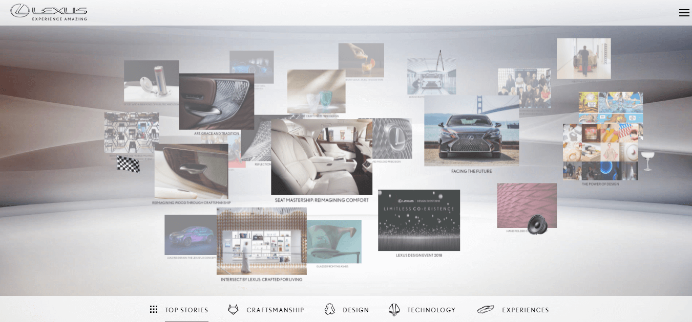
The official site that offers a line of Lexus is an awesome sample of using the clear iconic navigation menu.
In order to help you easily get the navigation menu done right, we come with a Magento 2 solution that offers the iconic menu out of the box. The Navigation Pro module provides visually pleasing iconic menu where you can also see text labels across the icons.

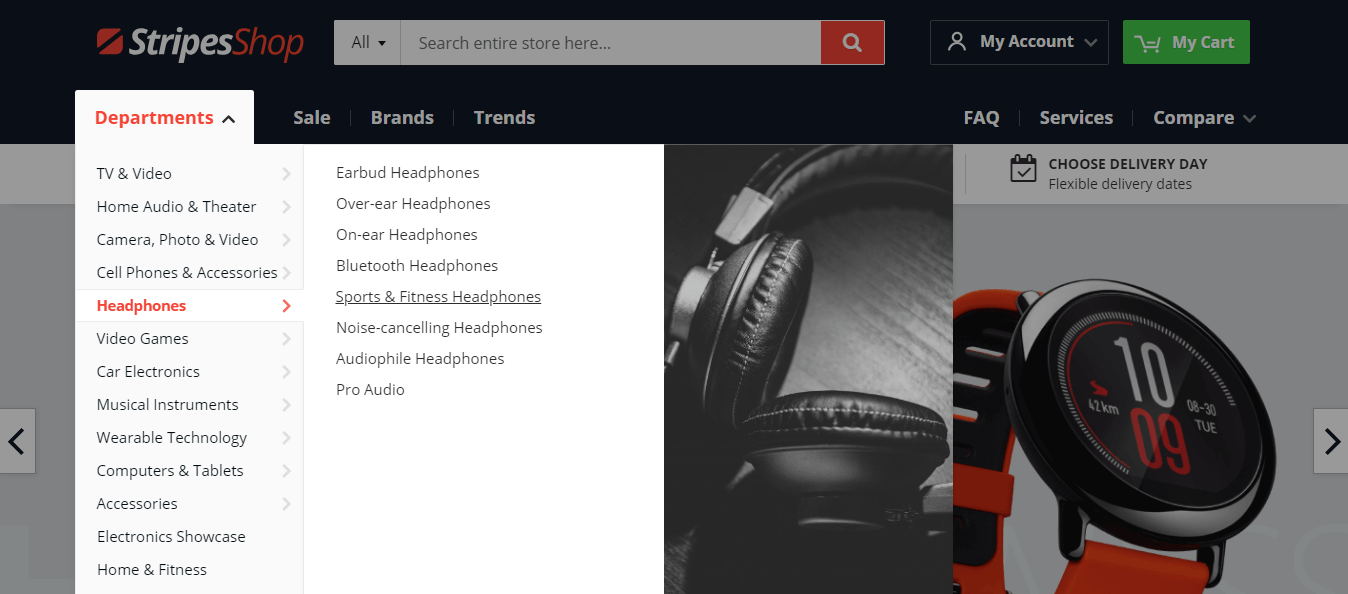
Skipping the submenu when moving cursor through submenu items
As you can see many large websites use mega-menus to let customers preview lower-level content. In fact, the good drop down menu can improve click-through rates. But sometimes your visitors can skip the submenu when a mouse moves down the list. We guess you've seen that before, even if you never noticed it.
Luckily we know how to resolve the issue. There are two ways this plays out:
- When the hover-activated drop-downs are short, it can happen that a drop-down menu disappears while users are trying to mouse over them to click a link. You can also meet the problem addressing a delay when activating submenus. It happens when moving mouse from the main menu to the submenu. To solve the problem, we recommend to set a "Delay time" option in menu configuration. By the way, the Navigation Pro for Magento 2 helps to avoid getting into this trouble when hovering dropdown menu. The module's logic provides that you will end moving the mouse cursor to the submenu you need. So, in other words, it detects the direction of the cursor’s path.
- Sometimes a hover plays a bad trick on the drop downs on hover. We talk about the same possible delay. When users try to move a mouse, a category sub-menu link can disappear out and users see the absolutely other submenu switched. In order to prevent this issue and provide an overview of a submenu what the customers need, the Navigation Pro module got the added Amazon's mega menu delay calculation. Try out the Amazon menu for Magento 2 navigation to see how quick and easy you can move the cursor into submenus. Each submenu will fill in fast.
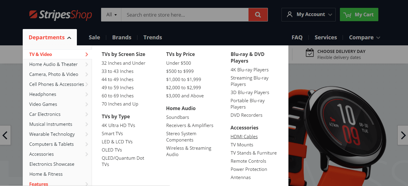
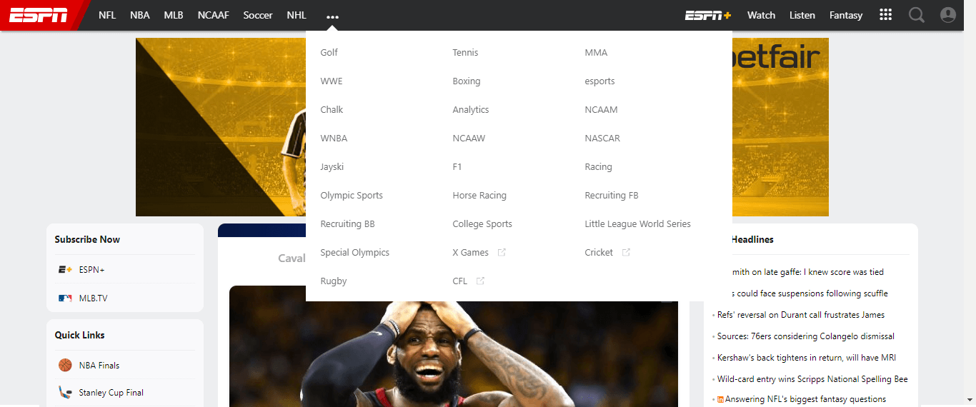
The main menu navigation is dropping down to two lines
You could meet a websites with breaking a line on the main navigation menu. On smaller screens it looks like some of the links have jumped down one line. Most often it can be seen on the store with lots of links. The owners of the websites with a lot of top level menu items in the header are too familiar with this problem. It can also happen when changing theme customizer settings or adjusting header styles of your website for different screen sizes.
To keep the menu clear and perfect on all screen sizes, you could use a nowrap feature. It enables rendering a menu in a single row despite of menu items count. In fact, the Nowrap option moves the top level items into separate drop down. This is how it looks on ESPN website that you can visit to get up-to-the-minute sports news coverage, highlights, scores and commentary.
So, in case you still want to have lots of menu items to display, and, yet, conserve space in Magento 2 navigation menu, check the Navigation Pro module. It includes the nowrap feature that is truly valuable solution for the stores with many links.
Magento 2 tool when you are committed to perfecting your main navigation menu
You already begin to see the Navigation Pro module solves common tasks in a variety of use cases. Have a look at additional amazing advantages of this Magento 2 navigation extension:
- Creating mega-menu, iconic menu, simple dropdown menu, Amazon menu (top and sidebar), stacked menu, side column menu
- Nowrap feature or ability to move top-level items into a separate dropdown, if they doesn’t fit on a single line
- Responsive design that looks great on all touch devices, tablets, and phones
- Ability to redefine variables in third-party themes
- Simplified configuration to create menu with a few clicks
- Ability to use Navigation Pro widget with themes support
- 7 drop down width modes.
- RTL support
- Overlay feature
The extension includes well organized and easy to understand user guide with lots of examples of how to create various frontend menus, complex dropdown contents, etc.
Designing the navigation menu should be given priority in the design process. UX design for navigation elements, for its part, should be well thought-out to provide your customers with the best navigation experience ever.
Now, does the article answer your questions? What else issues you met when designing the navigation menu at your Magento 2 website?
Write your thoughts on this post. We appreciate your comments.