“You deliver. You deliver, that's what you do, you deliver. Right? RIGHT?”
By telling the words of Strickland - the character from the " Shape of Water" that has won the Oscar, we are willing to consider the topic of delivering. Delivering the " best mobile experience" and getting a growing number of clients.
Recent statistics indicate that $35.9 billion was spent via mobile devices during the holidays. Furthermore, you know that the websites that follow the best practices for mobile-first indexing will be highly ranked by Google. Then the best mobile website design ideas remain as popular as ever.
The mobileness is not over. It should be easy to read, easy to navigate, in short, easy to use.
Stick to reading about things you probably don't know yet.
Reasons to have a site optimized for mobile
The mobile experience sets the tone! Talking about internet usage from mobile phones, we can say this trend keeps going up. The following statistics are a testimony to the importance of the mobile templates in providing exceptional customer service for e-commerce:
- The number of mobile phone users in the world is expected to pass the 5 billion mark by 2019.
- The percentage of internet usage through mobiles in some of the countries is as high as 79%. If your goal is to offer store content to the widest possible audience, take these stats into account.
- When it comes to search, most people in Europe, as well as USA customers, trust Google. So it would be very good to heed the demands of Google in regards to mobile. Google has changed the way it indexes sites. It means, shifting from desktop to mobile versions of a website. When you ask “ How do I increase my website ranking in Google?&rdquo, use the mobile-friendliness as a factor to improve Google rankings.
The content along with factors like speed and user experience
Thus, it is more than evident that day after day users search on mobile phones than computers. When a mobile generates more page views, it would be unwise not to make your site mobile-friendly. You will agree with us that responsive design is not enough.
Actually, the responsive design does not always work perfectly on mobile. Why? Because the headlines, the page elements, etc. are still written for desktop, not mobile. Creating dedicated pages for mobile will help your visitors stay focused. Google - he came up with an alternate plan to optimize a website on mobile devices. We are talking about Accelerated Mobile Pages (AMP).
What is AMP
Why do you need to implement AMP? Since starting AMP project, a significant progress has been achieved in the area of e-commerce. You can review the international retailer's reports, who have launched their AMP mobile site, to confirm this. In fact, all of them claim the dramatic results in:
- improvement in mobile page’s performance,
- an increase of conversion rates for new users and therefore the increase of mobile search traffic,
- reducing web page loading time.
We know how you want to achieve the same results. Well, there's your win-win tool. AMP module for Magento may be the easiest way to create web pages available in AMP version.
Nowadays, the AMP pages loaded much faster than the standard. If for any reasons you don't use AMP for your web store, you should not despair. However, you must continue to endeavor to improve the page loading speed for mobile users.
Website speed optimization
Google maintaines that page speed will be a ranking factor for mobile searches. The latest research shows that 53% of mobile users most likely will leave a page if it takes longer than 3 seconds to load. You don’t want to miss any visitor. Well, then let's reduce page load time.
Luckily, there are many ways to speed up your mobile site. When it comes to Magento speed optimization, you can focus on Magento Page Speed extension. Its image compression techniques alone are enough to earn the title. Most of them specialize in high-end image quality and make images load faster. For instance, the integrated Guetzli encoder will reduce the cost of the bandwidth usage for mobile thereby speed up mobile downloads.
It's clear that page speed of a website is a critical usability element. Learn what else truly affects user experience.
Easy to use mobile website. That we are going to talk about. Stick around.
How to make your website mobile friendly
To make a site usable and accessible on mobile, you have to implement some general practices in building mobile first experience. 57% of users say they won’t recommend a business with hard to read the mobile site. If you don’t want to be blacklisted, follow our tips:
Easy to tap
Are you sure that every visitor can tap all links? Look at areas that are easy for users to tap with their fingers and thumbs. It is important to remember that users hold their phones in different ways: one-handed, cradled or two-handed. So, when building a store page for mobile devices, design it for thumbs. That will help customers reach the controls, links and the other content in various areas of a screen.
Don't forget to make the entire element area clickable to ensure the thumbnail, price or a product header are easy to click by thumbs.
Scrolling and sticky elements
You might say that mobile users are compelled to scroll. However, sometimes scrolling on mobile, especially of small text size, is a challenge.
British multinational clothing, footwear and home products retailer named Next, has 700 stores in continental Europe, Asia, and the Middle East.
So clearly, they have a beautiful and highly usable website. Mobile users were not neglected, too. Do you even know how many countries the website is presented in?
Look at a great option that helps users avoid scrolling. Visitors are allowed to click alphabet letters to get the country name where they are from.
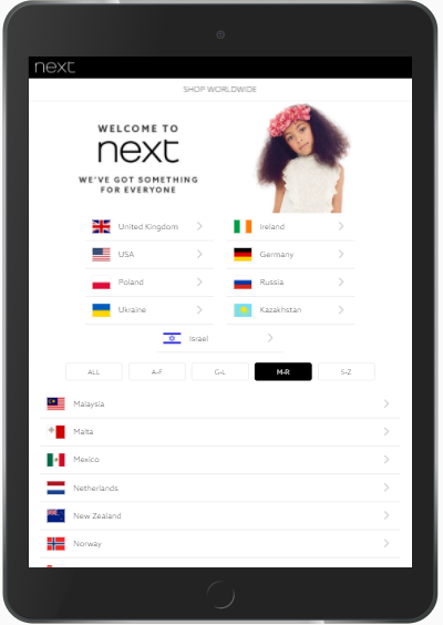
You can also use sticky elements to capture user's attention. By the way, the Next team also provides users with sticky functionality.
This additional technique allows you to retain content visibility within the viewport when the customer scrolls. Sticky headers, top, navigation, share links, sidebar, etc. become a very popular design element.
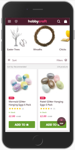
Hobbycraft is the UK's largest crafts retailer. Founded in 1995, it has more than 80 stores nationwide. Still thinking they need a technical indicator to succeed, the company has launched a new mobile website.
It is super fast and attractive. Large buttons are highly visible and easy to tap. In terms of visibility, we'd like to focus your attention on the sticky header. It makes your visible at all times the icons for store finder, search line, basket, and navigation menu. That way Hobbycraft site allows users to access important pages faster without scrolling each time.
Do you want to help users easily access the content they need without scrolling up each time? Review Argento theme designed both for Magento and Magento 2. The awesome template was specially developed to work on mobile devices. When it comes to "sticky" point, Argento includes the ArgentoSticky script that allows you easily transform any custom content into a sticky element. And furthermore, Argento supports AMP format. This really doubles your chance to deliver mobile-friendly content.
Clickable buttons
Most definitely you want your mobile customers to click a magic button. Follow 3 guiding principles:
- Easy to tap. We talked about this.
- Wide enough for thumb size. See more about thumb zone here.
- Attractive to press. One of the recommendations is adding some subtle gradient.
If you are not well-experienced in design of mobile buttons, you can use super tips on creating nice mobile buttons that respond to user interaction.
Auto detect, autofill and autocomplete
When it comes to usability on mobile devices, you just need to get autofill feature to enable customers to transact faster. The same thing could be said for auto-detect user country and address autocomplete features. They make filling all fields easier for users, boosting your conversion and revenue.
Autofill prevents frustrating when typing text on a small keyboard. You can provide users with this option through different extensions.
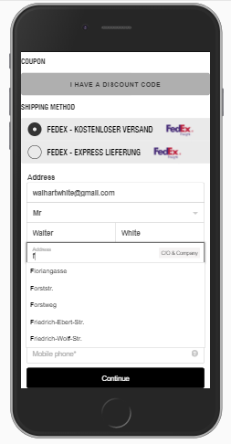
Marshall is UK company that offers the full range of headphones, earbuds, and speakers. Having more than 50 years in the music business, they have learned a lot. They have achieved great success in terms of the user experience, including mobile e-commerce.
When it comes to user-friendliness, address autocomplete feature is a must-have. Marshall store has implemented it to improve checkout page usability.
City and state auto-detection features, as well as address autocomplete, are must-have for checkout page effectiveness. Both options help users fill out forms faster and complete the purchase process online. Luckily, there are many tools that improve the filling address forms.
For example, Magento Google Address Autocomplete module will provide you with correct using autocomplete attributes on your forms.
Actually, the mobile checkout page is worthy of more than a few sentences in this paragraph. We' re going to pay more attention in this direction. Keep reading.
Overlay on mobile devices
The main task of an overlay is to show additional content or features while a user is still on the current screen.
Whatever different people think of overlay on mobile, in e-commerce, it is important and useful because it allows users to:
- view short piece of urgent content instead of navigating to the regular page,
- confirm their actions instantly, for instance, before a credit card charge,
- help customers make simple selections.
And for you - for the person concerned. Using overlay allows you to:
- direct the visitor's attention to a sub-task, without taking him away from the current screen,
- show some tips,
- display various options for sharing content,
- collect an information before letting customers proceed to the next step in a process.
Implementing overlays would be particularly useful given that the large versions of a product image can overlap the whole page content. In order to not show the image on subpages, a lightbox is commonly used to overlay images on the current page.
If you're looking for Magento solution that has lightbox (overlay) effect optimized for mobile devices, you could use Lightbox Pro module. Apart from extended overlay configuration, the module provides you with an option that offers users close a window by a click outside the image. That will allow customers to return to the underlying page.
CTA buttons on a single line
We have to go back to the scrolling. What we got to do to make it less. One of the helpful tips is bringing some options down to a single line. For instance, you can show "sign in”, “email” and Share buttons near each other. That makes possible to users see the important elements in the viewport without having to scroll or expand.
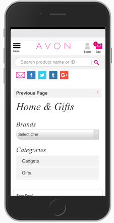
Avon was the first major cosmetic company to end animal testing. The company store was also the first in our research as a provider of bright and visible call-to-action button stand out from everything else on the page.
The Avon mobile website brings the high level of usability on mobile devices. On the screenshot, you can see social media buttons along with Email are placed on a single line right on the top.
Ideas for input field
Dealing with mobile users, you have to make input fields maximum readable and accessible. Here are some tips:
- Keep the design of input fields compatible with the data that users enter.
- Make fonts big enough. 14-16 pixels should be the minimum size.
- In the rules for thumb touch target, you might see 45–57px as a recommended. Meanwhile, sizing input fields between 32px and 40px in height will make the input field on mobile more finger-friendly.
- Use visual cues like fade in a box, different colors, flash in an arrow. All this creates a clear visual notification.
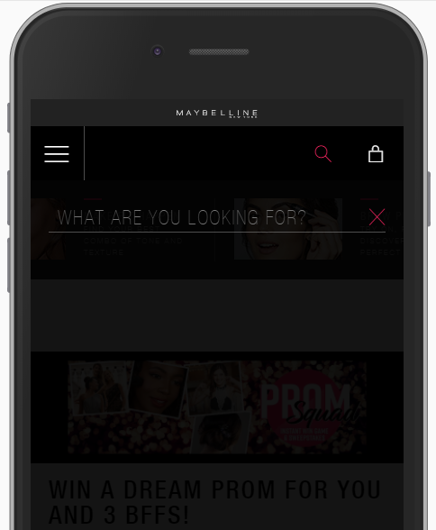
Maybelline does not need to be advertised. This world's leading cosmetics brand, available in over 100 countries, has lots of mobile sales.
The mobile store is easy to browse, easy to navigate and easy to check out. Here you can see visual cues as different colors used on search field input. This is a kind of an individual kind distinct from others. Slide-out navigation and numeric keypad for number fields are the additional advantages of a store.
On a separate note, this article would not be complete without considering a checkout page in your mobile strategy. So many things to learn.
Mobile friendly checkout
Though " Add to cart", " Proceed to checkout" and “ Place order” activities on mobile are still lower than on a desktop, you' ve just got to focus on mobile checkout page optimization. That day may not be far off.
Mobile checkout page design
The checkout page has the largest number of keyboard input entries. And your task is to provide mobile users with a checkout process the most convenient for a smaller screen.
When it comes to checkout page layout for mobile, the one-step checkout is not always relevant. Sometimes breaking up checkout steps into multiple pages that only take up half of the screen, you ensure that your customers are not frightened by endless inputs on the keyboard. Multi-step checkout is welcome.
To have an advantage in 1-column design where each input field is shown in a single row, check out one of the Magento tools. FireCheckout module comes with 5 different checkout page designs. One column step-by-step layout and 1 column expanded layouts are good progress trackers on mobile devices.
In case you run Magento 2 store, have a look at 1-column multistep Wizard layout of FireCheckout module. Every page is clear and short that allows users to concentrate on what they are doing.
Guest Checkout
Yes, yes, enable guest checkout. This usability technique helps you to prevent cart abandonment that often happens when you ask users to register upfront. And we have a tip for you. Place the " Checkout as a guest" at the top with its own button to proceed. Users would appreciate it because they do not need to fill in an email field in this step.
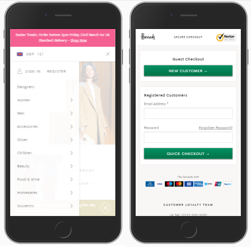
Harrods is UK most famous department store and all known online shop. It offers a wide selection of quality goods as well as perfect service. The mobile site also is not far behind the retailer shop when we talk about usability. Harrods allows users to purchase as a guest. You can see guest checkout and quick for registered customers options.
Among other feature, the website includes a slide-out navigation block, important CTA buttons shown on a single line, and much more options that help the company get ahead of competitors.
Just the important fields
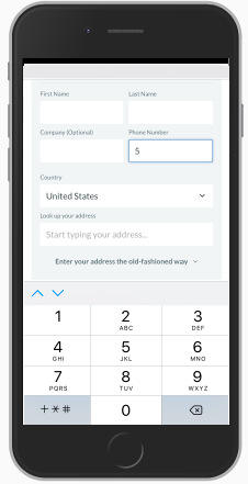
One of the most important things during mobile checkout is reducing input fields. Set the minimum required. That lets the customers type less, hence, they don't become annoyed with steps. What to do with address fields? Focus on a target audience. What might work for European users is not necessarily good for US customers. Address Fields Manager module for Magento 2 helps to create custom address fields and show only essential for your store.
Keypad for numeric input
In common, the websites provide users with a standard keyboard for numeric inputs. However, there is better practice for mobile form fields. When it comes to the phone number, PIN and credit card fields, set the numeric keyboard invoked. Providing an appropriate keyboard for numbers entry, you make it match with the requirements for those fields. That has a significant impact on user's form filling experience that is resulted in a better checkout experience as a whole.
ThinkGeek is an American website designed not only for computer fans and "geek culture". Both kids and ladies will love ThinkGeek's selection jewelry, clothing, gifts, and toys. The mobile website is pretty fast and user-friendly. But what we liked, is the default numeric keypad for number input set on the checkout page.
Field labels on mobile
Giving a hint to customers is what we are talking about in this paragraph. You are very likely to see the labels placed above the checkout fields. The labels help users to understand what exactly to have to input. The form field label is also good to touch the target element. So the customers can touch either the label or the input to start typing.
As for mobile, we have one more good tip. Enabling placeholder text with element name, you show to users what kind of information they should enter. Once users start typing, the placeholder text disappears. Indeed, the option saves space on mobile devices. You can also use a placeholder for short descriptions.
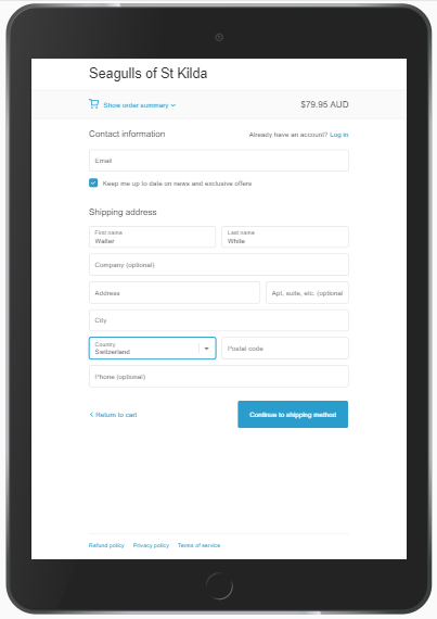
Situated in Melbourne, Seagulls of ST Kilda company creates truly enjoyable checkout experience. They provide a visual placeholder text, that doesn't disappear when visitors enter the data into the address field. Thus there is always a cue about what customer should input.
Whatever you want your customers to experience - labels or placeholder, try out already mentioned FireCheckout module for building perfect mobile checkout page. The module is available both for Magento and Magento 2 versions.
In a summary
If you want your store to be evaluated by customers, create unique content and easy browsing experience. If you want your site to be complemented by Google, build it mobile.
Our tips are the elements you need to know to evaluate a website from a mobile user point of view. To check the effectiveness of strategy on your mobile website, run it again through the ideas mentioned in this article.
We want to step your game up. Let's talk about how you did, right?