The ecommerce business is going to become more competitive. How to make it stand out? How to create the website that beats the competition? We strongly believe that the customer experience counts for a lot.
According to Walker study, the customer experience will overtake the product price and the product itself as a key trigger for increasing sales and customer loyalty.
Are you going to fight for a delightful customer experience? Ready to increase the overall site conversion? Let’s motivate your visitors with exceptional ecommerce product page.
In Conversio report we can see that among the 2,687 stores surveyed, the average product page conversion rate is 7.91%. So, the page is still worth investing time.
Today’s post will be not only about the must have product page elements. We're going to share our experience with you. There will be both the tips to improve the page and the common mistakes. For this article, we have found some beautifully designed and inspirational samples of Magento product pages that you can replicate for your store. Enjoy.
What are the essentials for the product page?
Before counting must-have web product page elements, let’s talk about what consumers expect from this web page primarily.
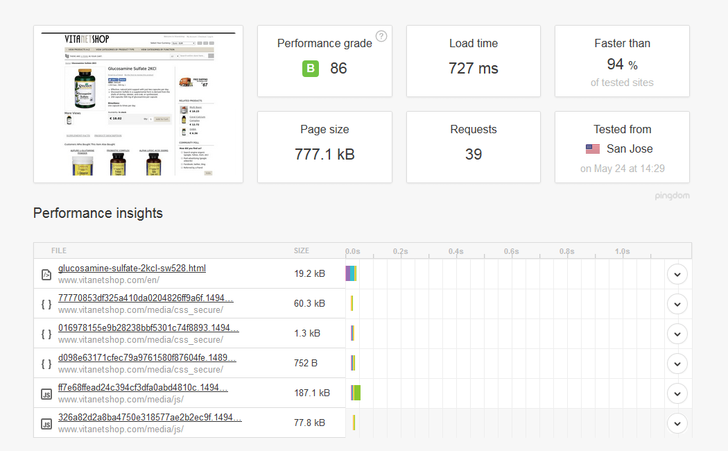
Product page loading time
Obviously, the page load speed is a significant ranking factor. There are a lot of ways to reduce product page load. First you should avoid overly large images as well as CSS styles for background and border elements. If you are focused on mobile sales, you really have to create AMPed product page to get fast loading product page on mobile. Read more about AMP project to improve load speed.
Clear product page layout
Simplicity is the key. Providing customers with extra white space, you will help them focus on the product page elements that your visitors actually find helpful. Focus on purpose of each specific product page. The less clutter on a page- the more chances for product to stand out. Try to balance minimalistic design with functionality. You still don’t know how to do that? We’re going to show you.
"The first step in exceeding your customer's expectations is to know those expectations." ~ Roy H. Williams, Author & founder of the Wizard Academy Institute.
Now we know the main customer expectations. Go on with reviewing the compulsory elements of your Magento product detail page.
Product Page Outline
What would be great to do in order to improve the default Magento product page and make that convert?
Let’s start from the product description.
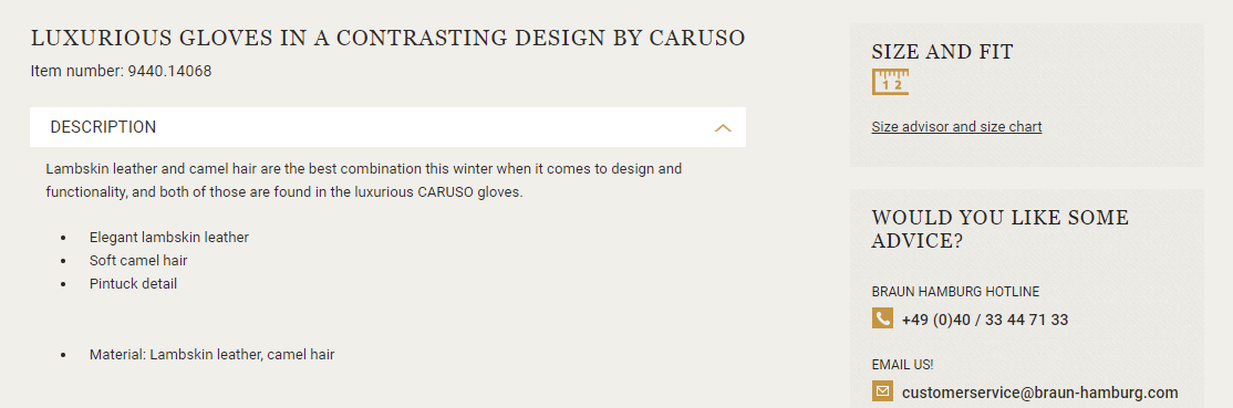
Product description
While making buying decision the users expect to see the most informative product description. On the one hand it should cover the main product characteristic like keywords, availability, price, shipping information, sizes/colors. On the other hand the product description should highlight why a customer has to buy this item. One thing we know for sure is that the description must be motivational.
The challenge is to find a happy medium.
We recommend you to stick to the following rules:
- Place at the visible area.
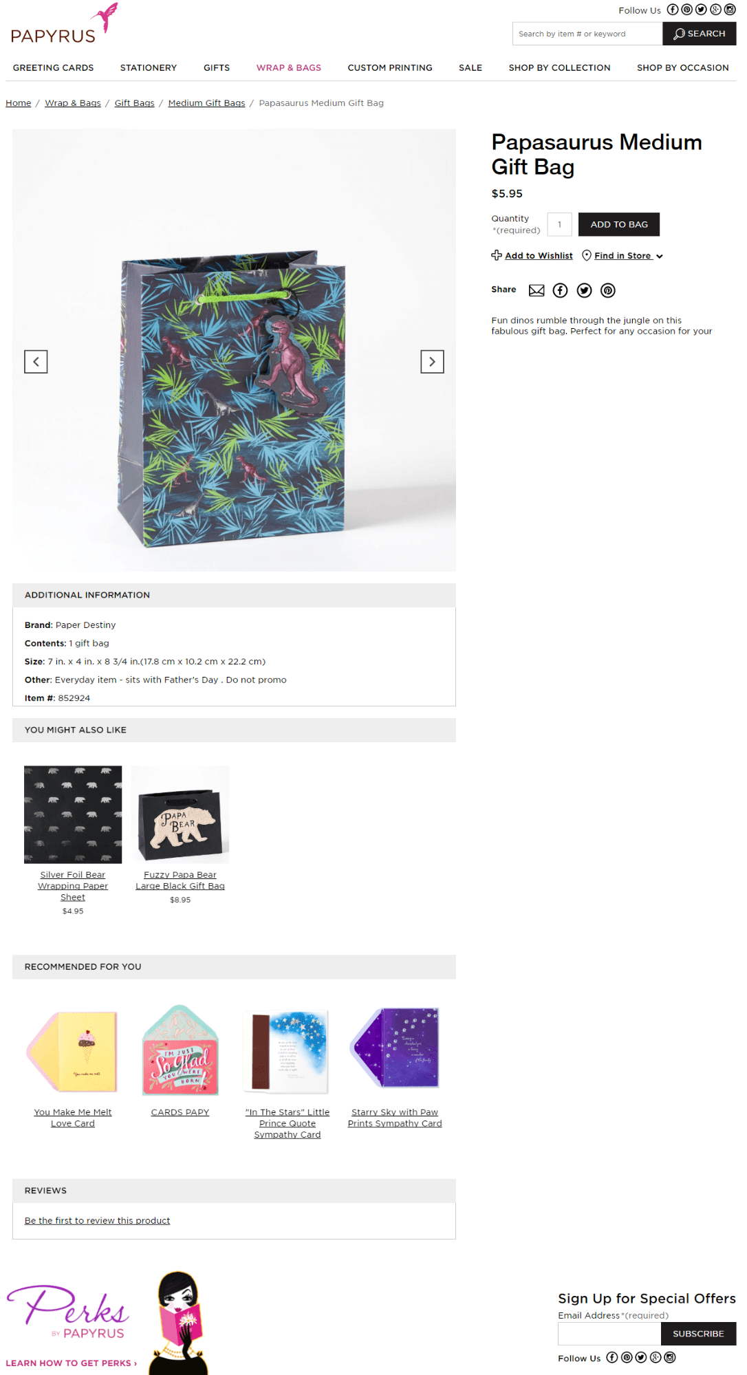
- Keep the description quite small. In order to show long version of a product, you can add that to the product page tabs. See how the tabbed content improves the product page of other stores.
- Use bullet points to present the product’s benefits and specific features. This will help users to get information fast.
The common mistake: repeated titles and description copied from the manufacturer site; the absence of text next to the product image.
Magento recommends: keep the title around 65 characters and avoid including your brand name because of possible SEO issues.
We’d like to add: avoid titles and description used by the product provider. Create the unique product description to help search engine see your product page content. If you agree that SEO has more impact on sales than branding, these tips for page title are for you.
Product image
Many people suppose the product image can speak for itself. Well, it’s even partially true.
Visual content really drives engagement in case this is high-resolution product images. The image should be clear and lively. We believe 9 of 10 customers consider the image quality “extremely important” when making a purchase online.
Have a look at tips you’d better follow:
- Use good, big, high-quality images.
- Use a timeless white or neutral-color background to help the product stand out.
- Show the different angles of your product.
- Add zoom functionality to give your visitors a more detailed look at the products.
The common mistake: flash photography; heavy image files. Read more about possible mistakes of product images.
Magento recommends: keep the main product image size 470 x 470 pixels. The image with zoom should be 1100 x 1100 pixels.
We’d like to add: allow customers to see all product details via improved zooming. Using the default Magento zoom functionality you will not achieve true zoom effect. Indeed, it’s good idea to use Magento zoom image extension to highlight every single piece of a product.
It would be logical to talk about the power of video now.
Video on product page
According to Unruly report, video can increase the purchase intent by 97%. By adding product video presentation you help users get the idea what the product is all about.
Product video is always effective online sales tool. So, why not to use it on your website.
The common mistake: adding video over 90 seconds; placing it at the bottom of the product page.
Magento recommends: add embed code to show video while creating product in admin panel. See user guide with codes.
We’d like to add: place video right next to the product image gallery. Use Magento video modules to give customers better view of the product. Our favorite one is Product Video extension. Check it now.
Awesome images and video make users ready to pay. Let them see the price.
Product price
Good idea is to place the price below the title. It looks naturally, because users usually stick to the top of the page. You can also show the price near the Add to cart button. It would be fitting considering the fact your customers are already willing to buy the product.
Nevertheless, there is basic advice:
- use larger font size to highlight the price
- choose a contrasting color to make the price more visible
- in case you show the regular and discounted product prices, you'd better show the higher price first - on the left hand side.
The common mistake: not specified shipping cost, the tax or any other additional charge.
Magento recommends: cross out the regular price when you show the discounted one. The Special price appears in bold red.
We’d like to add: make the price proposition hot with daily deals block. This will help you to create an urgency around buying a product. Try out Magento solution to show users they can benefit from good product price. If you will be updating the deals regularly, you will give customers a habit to visit your website in the pursuit of best price.
Reviews and testimonials
Do you know that 90% of shoppers are looking for reviews of products before making a purchase? There's a cue for you. Get customer reviews at all costs. Moreover, the reviews create unique content for your store. Actually this is the user-generated content, that brings SEO back.
Testimonials have the same power as user reviews. However the testimonials provide you with great advantage such as always positive customer feedback. Having full control over customer testimonials allows you show your store products in a positive light.
The common mistake: product reviews missing.
Magento recommends: make the “Add Your Review” link highly visible in order to encourage customers to add reviews. For products that haven't been reviewed yet, there's a link “Be the first to review this product.”
We’d like to add: let's show testimonials list on the product page. You can do that via Free Magento testimonials module widget. Product testimonials help to outline the product benefits and increase the website credibility.
It’s time to force customers to buy.
Add to cart button
Add to cart button is the most powerful button on ecommerce product page. You just have to place it in the centered position to help users find it easily. Make the button clicked with following recommendations:
- use bright contrasting button color. Be careful with red color. You should avoid that on a black background
- set white space around the button
- play with rectangular or rounded shape
- use trigger words
The common mistake: “add to cart” button is not active.
Magento recommends: just customize.
We’d like to add: be in the same boat with your consumers. Speaking the user’s language is always good idea. So, when you're selling mostly for the U.K. customers, you can use "Add to basket" button. The term "cart" is more natural for USA market. You can also meet “Add to bag” button. And all the rest - is already just a matter of taste.
What else would we recommend to focus on?
Cross-sell and related products list
Offering extra products related to the main one is really good idea. Let's see what you can get by suggesting users additional products directly on the product page:
- the increase the average order value
- longer time of visitor engagement on the page
- the improved user experience.
Just properly choose the products priced lower and motivate users to increase the shopping cart content.
The common mistake: wrong products choice for cross-selling list. The products are not linked to that segment.
Magento recommends: place the related product block in the right column in case this is a 2 column page layout; show up sell products under a heading such as “You may also be interested in the following product(s).”; show cross-sell products on the shopping cart page only, just before the customer begins checkout.
We’d like to add: start your cross-selling strategy on the product page. Why not to improve the default Magento “who bought this also bought” suggest block. With Sold Together extension you can offer the complementary products which the customers likely need. Only 12% of companies can apply cross-selling techniques successfully. We believe you’ll become one of them!
Giving you an idea of how you can improve your product page, we’d like to review live Magento sites with you.
Keep reading to be inspired with highly converting Magento product pages.
Magento store product pages
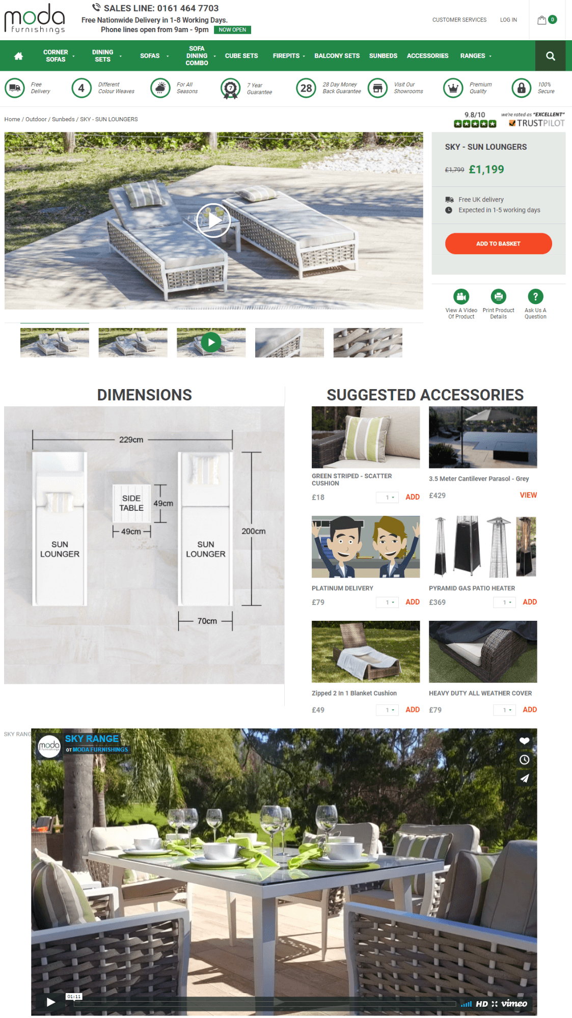
Meet the awesome dynamic website with creatively designed product page. It is following all guidelines so important for usability on a page. The embedded vimeo video brings enjoyable experience; the suggested products and product dimensions are shown as attractive images. You can see lots of bright icons around the page. By integrating them into product page, the Moda Furnishing website has shown the products' benefits as stylish and easy ways to find.
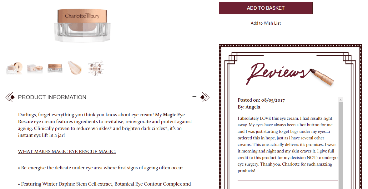
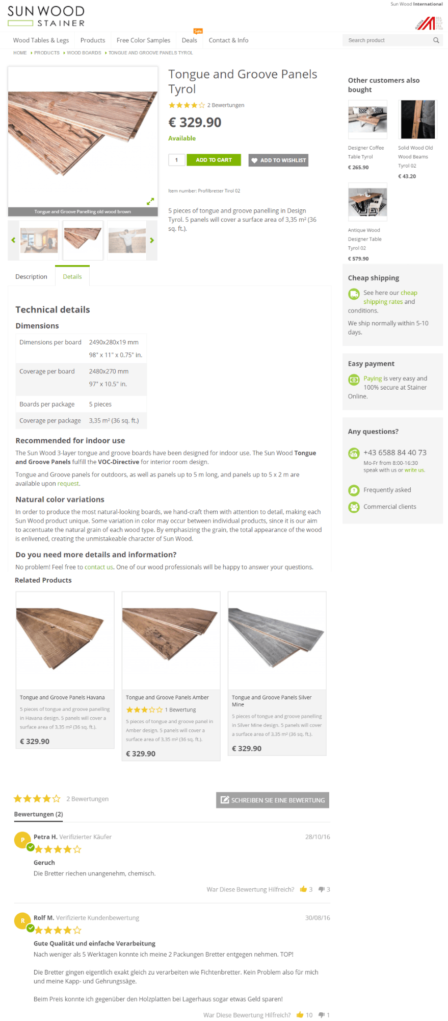
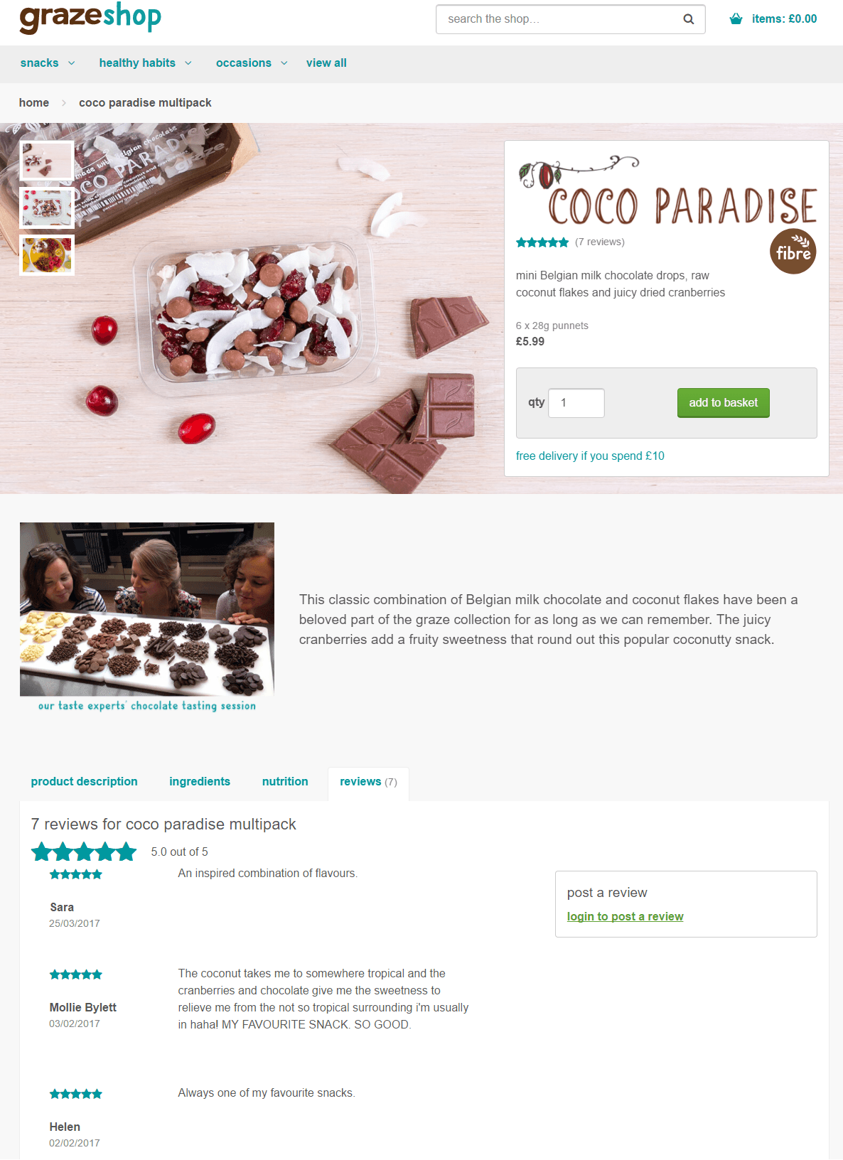
Follow this product page to see how to show all product benefits on the same page. The page is featured by awesome image gallery, extended product description with embedded video, product reviews, related products. In a sidebar directly on the product page you can see the list of products that customers bought together with the product on that page as well as the Shipping and Payment info. So much important information - all in one place.
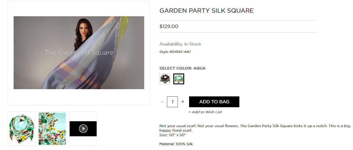
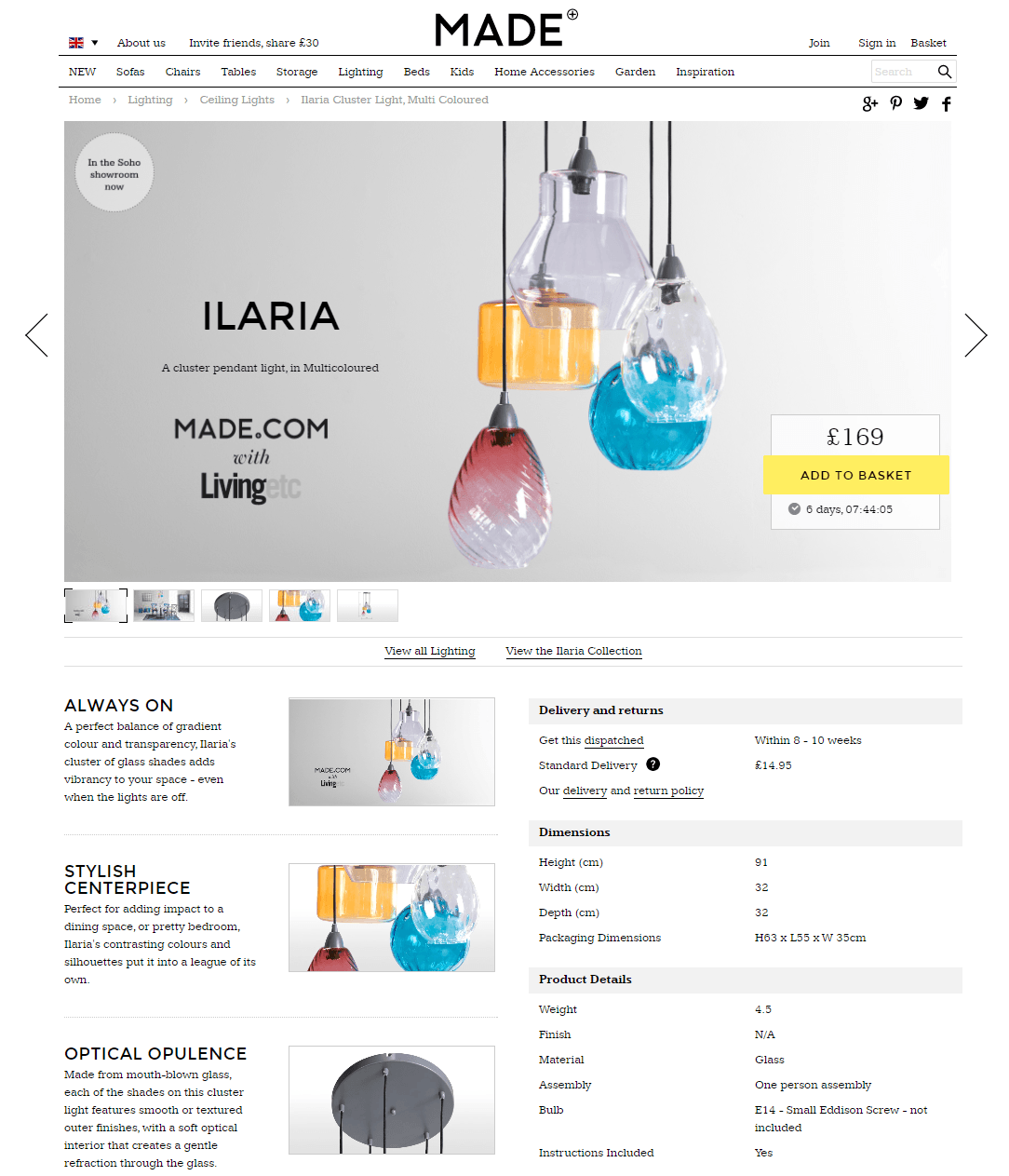
In our opinion, the product page is really attention grabbing. Nice product image is stretched the full horizontal width of the screen, that looks simply amazing. You can also see perfect description and the detailed information not hidden neither in tabs nor in dropdown. It actually looks very organic. Please pay attention on countdown timer near the add to cart button. It acts as a trigger to complete the purchase.
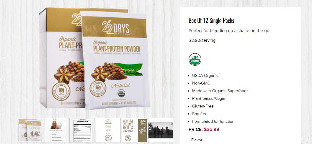
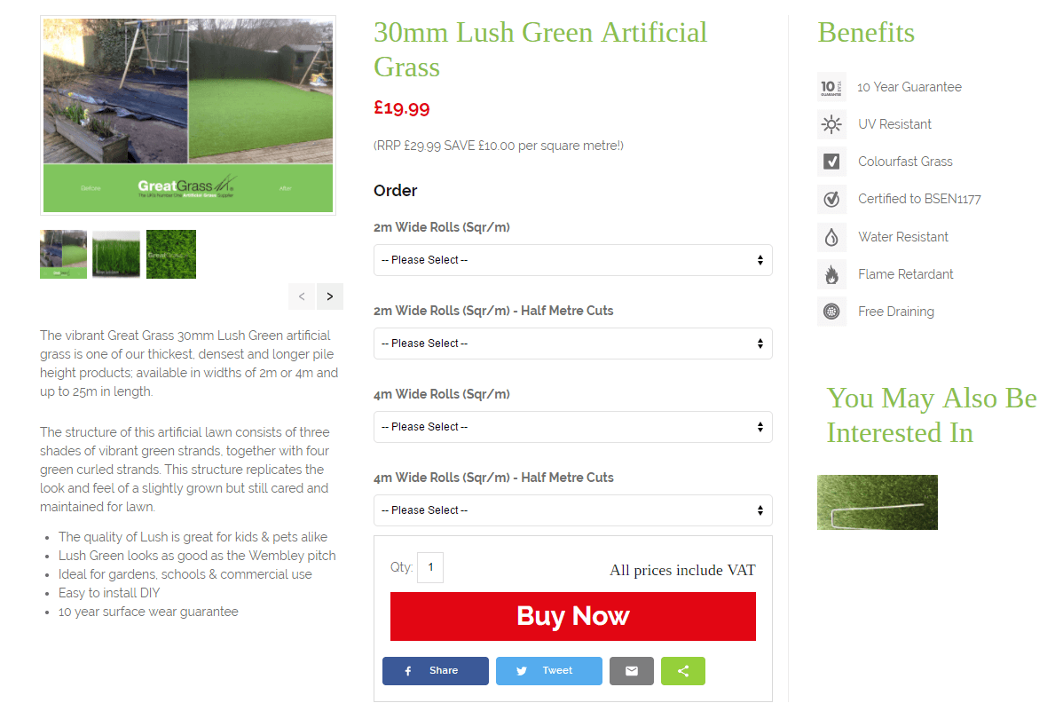
The website comes with product page that heeds the tips mentioned above. Here you will see nice background for product image, highly visible add to cart button, short and long product description that is shown in tab, notification about delivery cost.
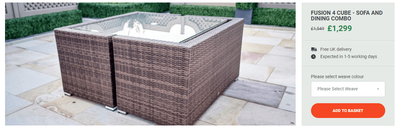
This is the product page where the minimalism is used beautifully. Clutter-free page design helps you to focus on the product. What we’d like to point on is easy-to-use cross-selling block. We see the Budd company is on the right tack for doubling sales. 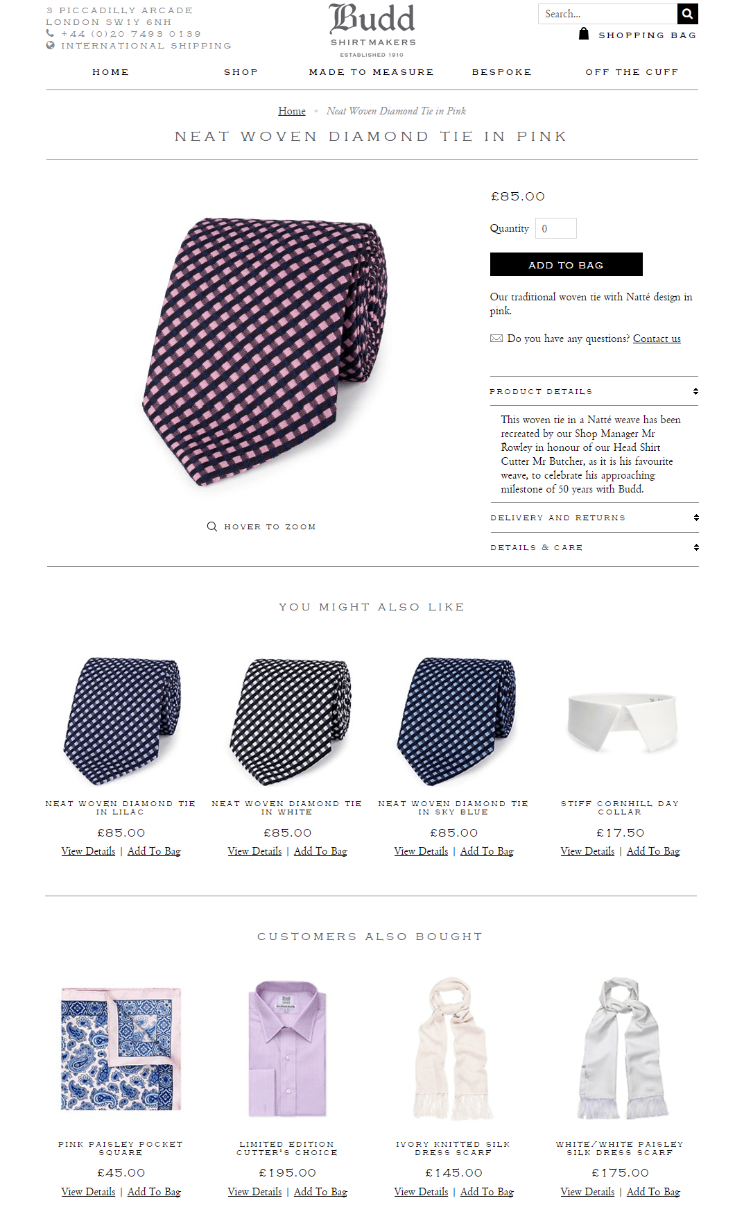
We hope you'll find today's post much valuable for your ecommerce. If you're interested of good conversion for other landing pages on your site, please enjoy the article with tips for creating highly converting landing pages.
As you can see we keep writing about website usability best practices. Our goal is to help you give customers what they expect. The modern consumer demands an intuitive navigation through the website, super fast page load, etc. Meet our practical with nice ideas and samples to be on close terms with navigation in your store.
What are the exciting ideas impacting your own ecommerce website? How are you implementing them? We appreciate you telling us about it in comments.