
What is the most important on the way to completed purchase? Do you agree that this is a checkout process? To succeed in a good sales conversion rate, you need it to be seamless and fast.
In this article, we will explore the 8 highest revenue-generating e-commerce companies from different categories. In particular their checkout pages.
We will show you the fastest and simplest checkout process we' ve seen. You will see the features the companies use to streamline the checkout flow. So you could choose the best possible checkout functionality for your own store. At the end of the post, we’ re also gonna offer you an easy way to implement the required options. Now, let's get to it.
Best checkout pages for top ecommerce
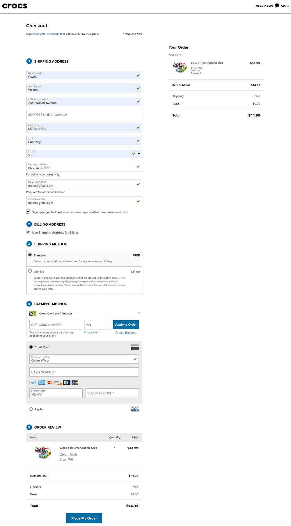
Crocs is an American company, based in Niwot, Colorado. It distributes and once manufactured foam clog shoes. Millions of users worldwide enjoy a selection of comfortable and casual shoes. The company constantly takes shoe comfort to new levels, and the same applies to their website.
They display a checkout page in a single column. You can see customized checkout page elements that make the page visually attractive and simple to fill. We liked the process. It's fast and simple.
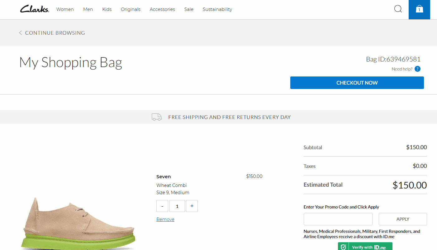
Clarks is a privately owned business and based in Somerset, UK. The company offers crafted shoes for men, women, and kids. A shoe selection is as nice as the website UX/UI. Look at the checkout page design.
Clarks offers an excellent checkout page customized with different design elements: appealing icons of checkout progress indicator, catchy CTA buttons, highlighted entries, etc.
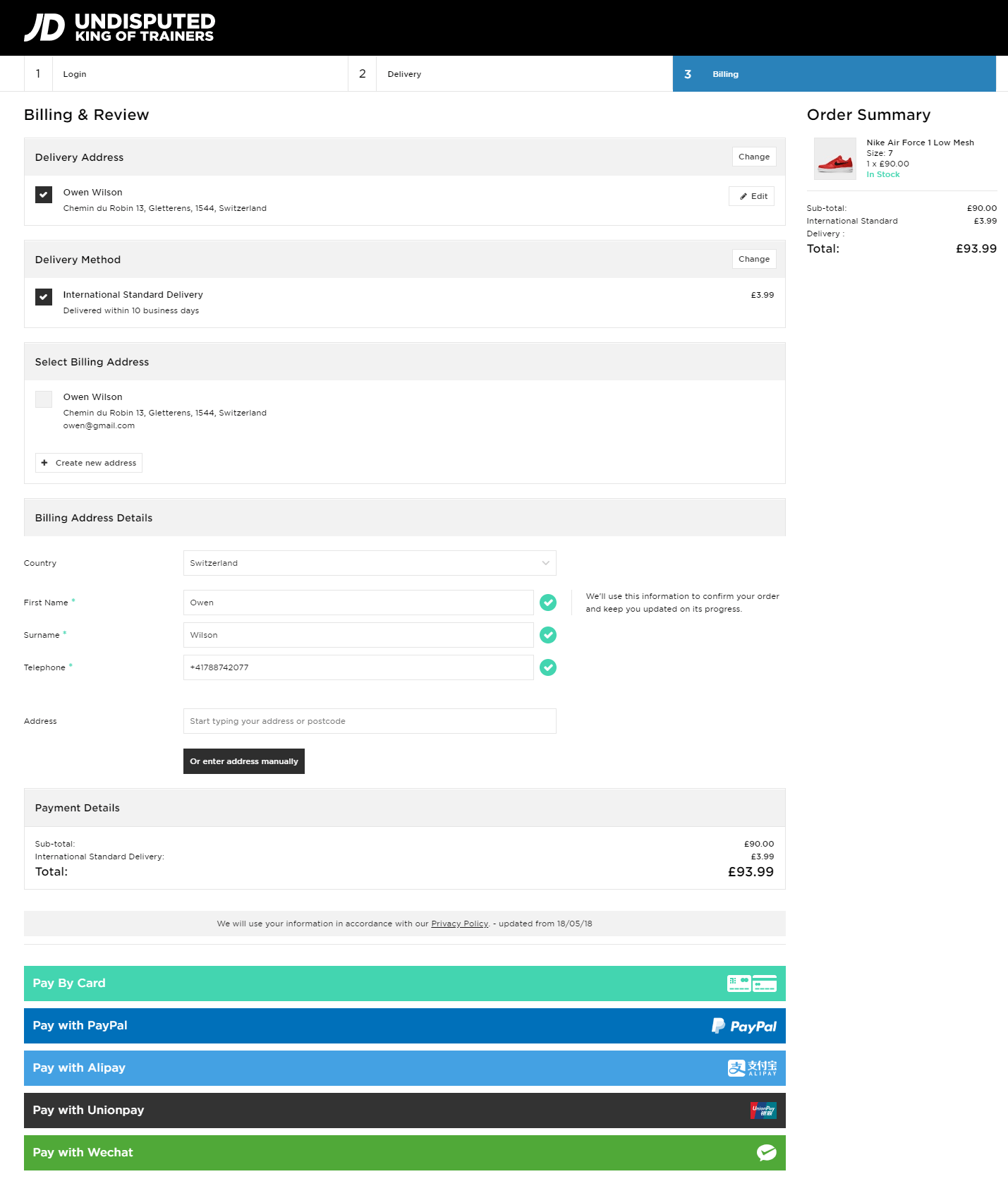
JD Sports is the leading sports fashion retailer in the UK. It offers an extensive online range of apparel and shoes. The company is famous for outpacing its rivals. Even taking into account the website checkout flow we see they know how to boost a conversion rate.
JD Sports is one of the fastest checkouts we’ ve seen. The checkout page offers a range of options for excellent checkout experience: a variety of payment methods, address autocomplete feature, customized well buttons, checkout progress indicator.
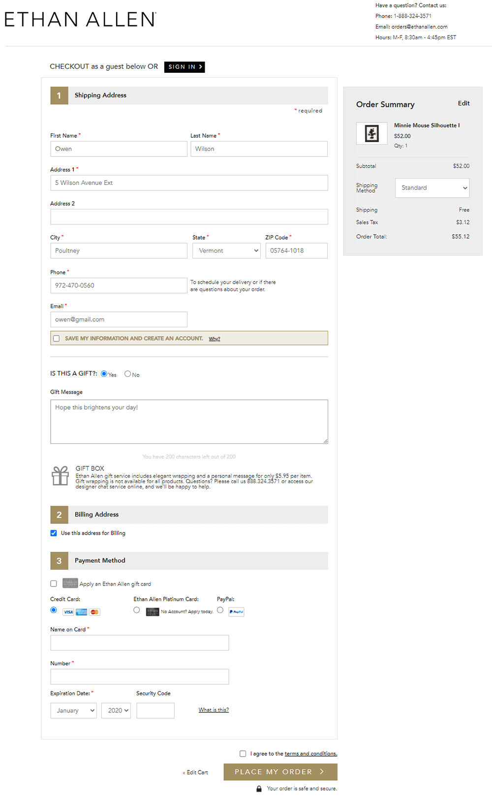
Ethan Allen is an American furniture chain with more than 300 stores across the United States, Canada, Europe, Asia, and the Middle East. It is famous for its high-quality and premium class products for every room.
In addition to thousands of custom options, the company demonstrates a well-designed one column checkout page.
We'd like to highlight a sticky order summary block, gift card feature, and the user-friendly drop-down with shipping methods.
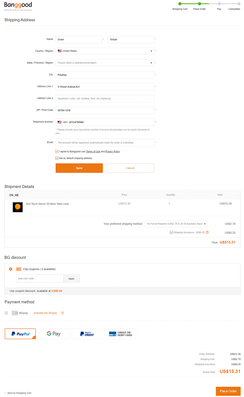
Banggood.com is one of the best e-commerce sites to buy products from China. The store offers retail goods, gadgets, tools, and many more quality items.
Banggood.com designed its clutter-free checkout page to avoid confusing users and to save their time. Minimum required fields. Well-organized checkout forms. Checkout progress indicator. Variety of payment methods highlight with catchy brand icons.
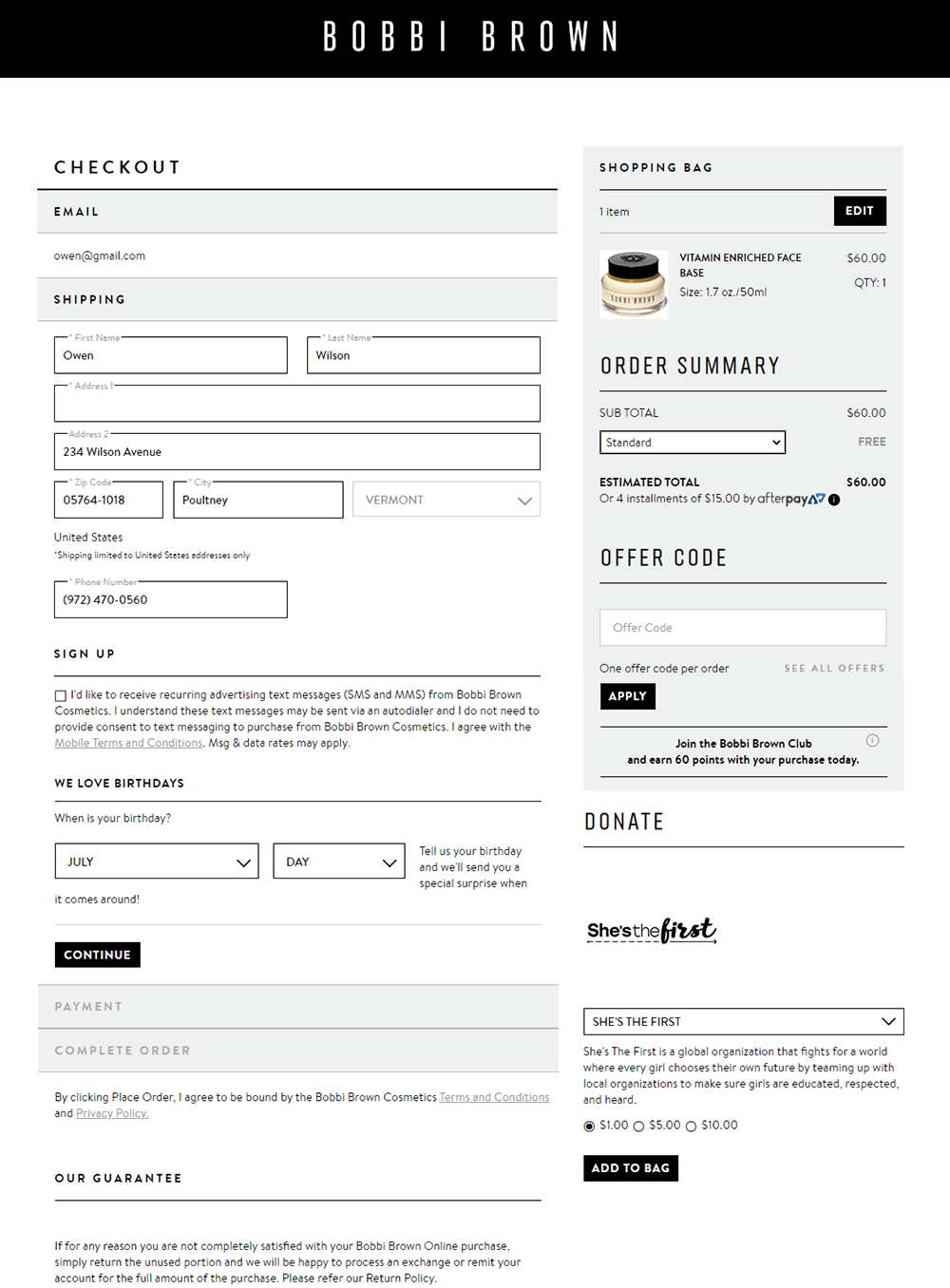
Bobbi Brown Cosmetics is a top eCommerce place to help you buy makeup and skincare products. This US company is famed for its 'natural-looking' makeup. We do like it's great user-friendly website as well as the way how they help customers easily flow through the checkout.
Besides clean and modern checkout page design, address autocomplete feature, we want to pay your attention to additional checkout fields. They are displayed for customers right during checkout without navigating them to another page. This way the company collects the required information to provide clients with better service afterward.
A bit later we' re gonna show you the tool that will help you to add extra fields with ease. Keep reading.
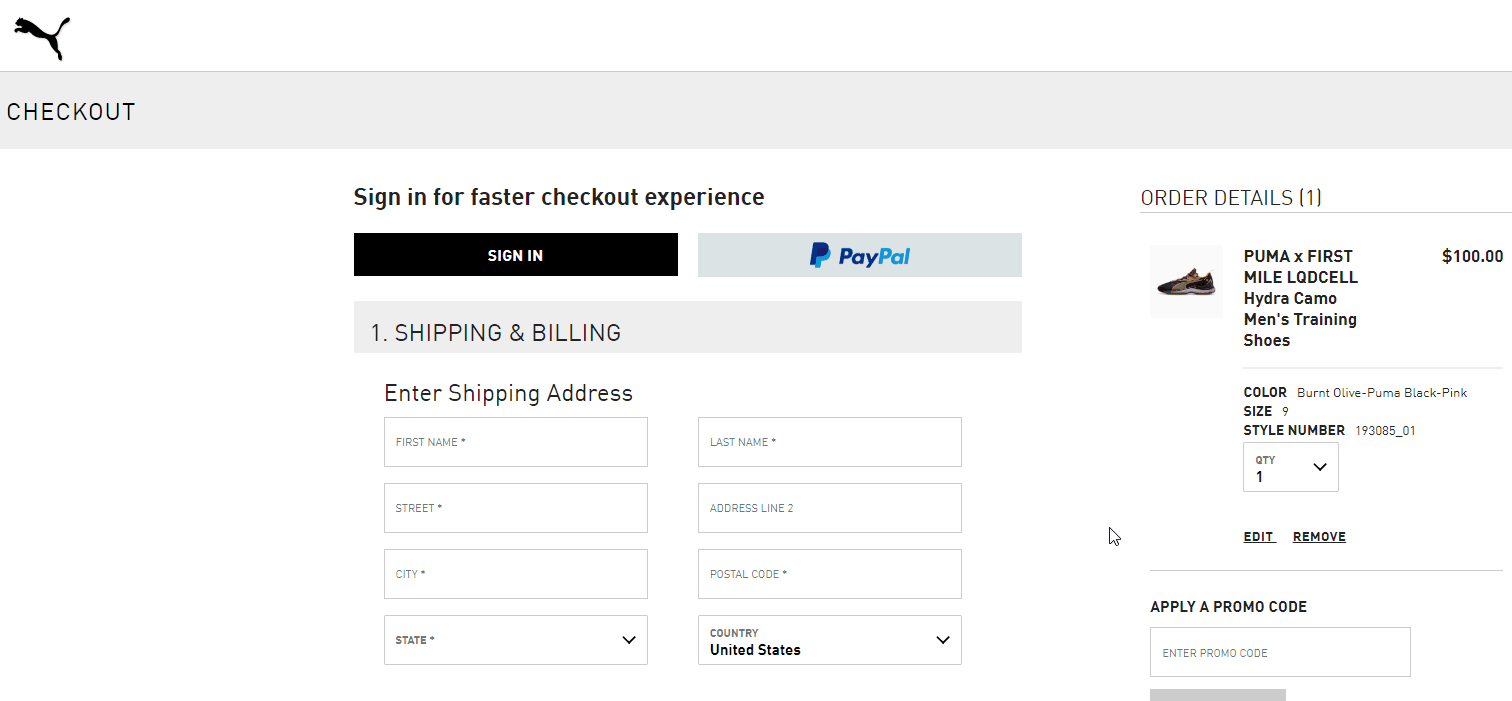
PUMA is not a company, it's a lifestyle. So no need to explain why the website is cool. You can see clean checkout forms and eye-catching CTA buttons that encourage customers to take the required actions.
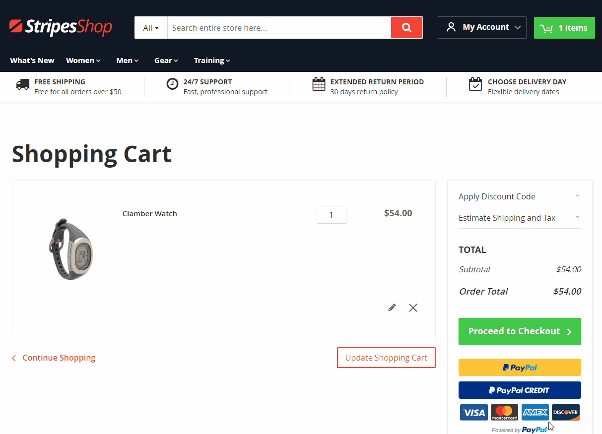
The main reason we would like to draw your attention to the checkout page is the editable product quantity in the order details block. We've rarely seen it on other checkout pages, however, the feature is important for positive user experience.
The opportunity to change the product number or remove some items without redirecting back to the shopping cart page basically saves the user time.
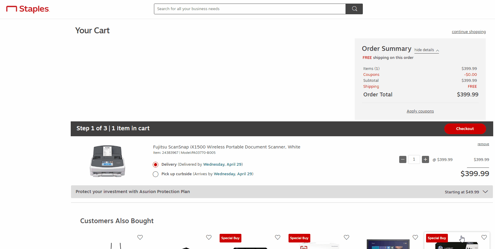
Based in the U.S. state of Minnesota the Staples company did beat many stores on the list of top e-commerce retailers. Providing shoppers with a variety of its own brands, product catalogs, and amazing service, Staples site is definitely worth your attention.
When it comes to the checkout process, we see it as very fast and convenient. The page presents checkout user experience with 3 steps which are placed just below each next making all of them accessible.
Pay attention to the bottom of the checkout page. You can see there blocks for additional content. Staples highlights the advantages of their service. So you can also show the information related to your site benefits.
Well, we hope you liked checkout page designs from leading eCommerce companies. You' ve seen how they support the customer in moving checkout steps seamlessly.
Feature-rich functionality, nice layouts, unique checkout elements. All famous retailers apply this in practice. They have the same goal - optimize the checkout page for sales.
Best practices to perfect eCommerce checkout combined in one tool
Checkout practices have continued to improve with new ideas every day. And now we want to share with you our ideas. Or more to the point, our solution for the checkout page. The FireCheckout extension for Magento 2 platform.
Let’s see how it may help you to implement the checkout options mentioned above in the article.
With the extension, you can choose up to 5 checkout page layouts. In a special article we described which is better for your store.
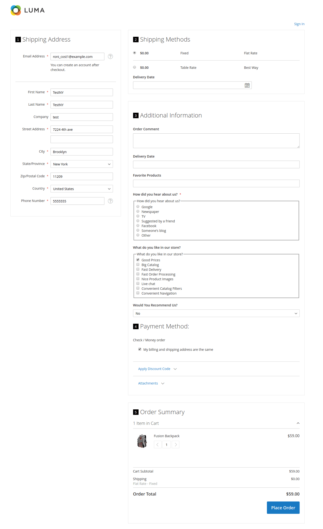
Today we show you the ultimate checkout functionality based on 1-column Wizard layout. As you may have noticed the one-column layout has been chosen by many famous stores.
As you can see the FireCheckout module has provided multiple options that help customers move through the checkout faster and easier.
- Address Autocomplete feature makes address entry easier and suggests addresses as user starts typing.
- Delivery Date feature enables easy choosing the date of the product delivery most suitable for the client.
- Checkout Cart feature allows for updating product quantity or removes it from the cart while users are still on the checkout page.
- Additional Content settings enable the display of extra content below/above Firecheckout form or below/above place order button. You can show noteworthy information directly during checkout without sending customers away from the page.
In fact, we collected the many more nice practices in our FireCheckout module. For instance, you can also show additional checkout fields of different types to be filled during the checkout process. Bobbi Brown site used that awesome feature.
With our module, you can get more advanced customization. You are able to change almost every single element in your design to make it stand out. Your customers should see clearly where to click to reach the next stage of checkout. Learn more from the Customization article.
FireCheckout has 4 beautiful themes. We'd like to show you how the Midnight theme looks based on a 3-column layout.

Our extension has so many useful features to present on your checkout page. They are GeoIP, order attachment feature, newsletter subscription checkbox, Vat validation functionality. These options are truly helpful on the way to a completed purchase.
In summary
Do you like the checkout pages mentioned above? Or you've already experienced a checkout in some of those stores, perhaps.
We assume there are the elements or features you'd like to apply to your store. For this reason, we' ve shared with you our Magento 2 one page checkout solution. We assure you that you can rely on the FireCheckout and on our team to help you implement the best checkout layouts and functionality.
We are happy to hear your comments and opinions on our article. Would you like to share them with us?